Like it or not, the so called “Hamburger” design pattern has made its way to pretty much every platform, including the Windows Universal Apps!
Most Windows 10 native apps already show this new pattern, even a classic like the Calculator app!
However, for reasons unknown, Microsoft didn’t provide any Hamburger related control on the SDK base controls… frankly, this move brings back to memory when Windows Phone 7 SDK was launched without the Panorama and Pivot controls, the foundation of the whole “Metro” design guidelines!
The only alternative I’ve found is to use the Template 10, a “set of Visual Studio project templates”!
However, I’ve found that Template 10 version for Hamburger adds a bit of too much “fat” for my own taste, hence why I’ve been working on an alternative for the past last few weeks!
Introducing the Cimbalino Toolkit Controls
Starting with version 2.2.0 (currently still in beta 1), the Cimbalino Toolkit will feature a new package called Cimbalino.Toolkit.Control, and as the name suggests, it’s a control library for app developers.
Currently, the package features 3 controls:
- HamburgerFrame
- HamburgerTitleBar
- HamburgerMenuButton
HamburgerFrame
Starting from the top, the HamburgerFrame control is a full replacement for the native Frame root control used in the app.xaml.cs file.
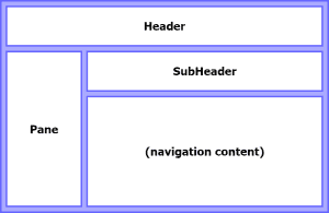
The control provides 3 content containers represented by the Header, SubHeader, and Pane properties, and on the center, it will show the navigated content:
Obviously, you can specify content for this containers however you would like, or just leave them blank!
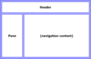
The Header allows content to be presented above the Pane, so it will never be hidden by it:
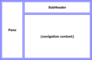
The SubHeader allows content to be presented on the right side of the Pane. This means that if the pane is in one of the “overflow” modes it will show on top of this container, hiding the content behind it:
The control also provides background properties for all these containers (HeaderBackground, SubHeaderBackground, and PaneBackground).
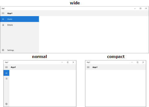
To make the life easier of developers, I’ve “borrowed” the VisualStateNarrowMinWidth, VisualStateNormalMinWidth, and VisualStateWideMinWidth properties from Template 10, which allow to specify the break points where the pane state and location will readjust. If you don’t want to use these, you can always do it manually with the exposed pane related properties (IsPaneOpen, DisplayMode, OpenPaneLength, CompactPaneLength, …).
HamburgerTitleBar
The HamburgerTitleBar control provides a basic Hamburger button on the left side (can be hidden with the MenuButtonVisibility property), and a Title property.
This is a quite rudimentar and easy to use control, yet developers might want to just go ahead and create their own version of this control and place it on their apps!
HamburgerMenuButton
Finally, the HamburgerMenuButton is the button you’ll be using in the pane to indicate the available menu options!
This control shows a left-side icon and an optional label (through the Icon and Content properties):
The regular approach here will be to just place all the HamburgerMenuButton controls inside a vertical StackPanel, but one can also stack them horizontally, and in this case, we would only show the icon and hide the label (using the provided LabelVisibility property).
The NavigationSourcePageType property allow developers to specify the destination page type for navigation purposes. If the property is set, the button will automatically highlight anytime the page is the frame current navigation content.
So how can I use these in my app?
First step is to add the Cimbalino.Toolkit.Controls NuGet package to the project!
Then, create a new user control to define your menu; in it, add as many HamburgerMenuButton instances as the number of options you want to present!
Here’s how your menu might look like:
<UserControl x:Class="App1.View.HamburgerPaneControl"
             xmlns="http://schemas.microsoft.com/winfx/2006/xaml/presentation"
             xmlns:x="http://schemas.microsoft.com/winfx/2006/xaml"
             xmlns:controls="using:Cimbalino.Toolkit.Controls"
             xmlns:d="http://schemas.microsoft.com/expression/blend/2008"
             xmlns:mc="http://schemas.openxmlformats.org/markup-compatibility/2006"
             xmlns:view="using:App1.View"
             d:DesignHeight="300"
             d:DesignWidth="400"
             mc:Ignorable="d">


    <Grid>
        <Grid.RowDefinitions>
            <RowDefinition />
            <RowDefinition Height="Auto" />
        </Grid.RowDefinitions>


        <StackPanel>
            <controls:HamburgerMenuButton Content="Home" NavigationSourcePageType="view:MainPage">
                <controls:HamburgerMenuButton.Icon>
                    <FontIcon FontSize="16" Glyph="& #xE80F;" />
                </controls:HamburgerMenuButton.Icon>
            </controls:HamburgerMenuButton>


            <controls:HamburgerMenuButton Content="Details" NavigationSourcePageType="view:DetailsPage">
                <controls:HamburgerMenuButton.Icon>
                    <FontIcon FontSize="16" Glyph="& #xE8BC;" />
                </controls:HamburgerMenuButton.Icon>
            </controls:HamburgerMenuButton>
        </StackPanel>


        <controls:HamburgerMenuButton Grid.Row="1"
                                  Content="Settings"
                                  NavigationSourcePageType="view:SettingsPage">
            <controls:HamburgerMenuButton.Icon>
                <FontIcon FontSize="16" Glyph="& #xE713;" />
            </controls:HamburgerMenuButton.Icon>
        </controls:HamburgerMenuButton>
    </Grid>
</UserControl>
Next, open the app.xaml.cs file and replace this line:
rootFrame = new Frame();
with this:
rootFrame = new Cimbalino.Toolkit.Controls.HamburgerFrame()
{
    Header = new Cimbalino.Toolkit.Controls.HamburgerTitleBar()
    {
        Title = "App1"
    },
    Pane = new View.HamburgerPaneControl()
}
Congratulation: your app now has a universal Hamburger menu with a nice title bar! :)
Next steps might be to create a separate user control to hold the HamburgerTitleBar, which will then allow you to bind the Title property to view model (making it easier to update on a page by page basis).
To make things easier, I’ve provided the source code for a simple app using these controls!


